AI images on LinkedIn – new rules, reduced reach & SEO pitfalls
1. AI images on LinkedIn: The new rules from August 2026

From August 2026, the EU AI Act will introduce stricter transparency requirements for AI-generated content. Many companies and self-employed individuals already use tools such as Midjourney or Gemini for professional LinkedIn images – but not every AI image will need to be labelled in future.
The key factor is whether the image appears deceptively real or misrepresents a real event that never took place. A labelling requirement may apply particularly to photorealistic business portraits, altered faces or staged scenes.
The situation is different for clearly recognisable illustrations, comics, infographics or creative design elements. These often fall under exceptions, as they are not perceived as real photography.
It is therefore particularly important to handle AI-generated content in a conscious and transparent manner. Not every form of editing is automatically problematic – but the more realistic and manipulative an image appears, the more relevant the transparency requirement becomes.
Brief explanation of Article 50(4) of the EU AI Act:
Anyone using AI to generate or manipulate images, audio or videos that appear to be deepfakes (i.e. look deceptively real and simulate real people or events) must clearly label the content as artificial.
Exceptions: In the case of works that are clearly artistic, creative, satirical or fictional, a discreet label (e.g. in the text) that does not detract from the work is sufficient.
2. LinkedIn bundle offers for company pages:

LinkedIn officially offers a bundle comprising a ‘Premium Company Page’ and a personal Premium subscription with a 20% discount. This offer is only available to eligible page administrators (‘Super Admins’) and only when purchasing the bundle for the first time.
Existing personal Premium subscriptions cannot usually be transferred directly into such bundle offers. In many cases, the active subscription must first expire or be cancelled. Whilst a bundle is active, the personal Premium subscription cannot be switched to a different plan or upgraded.
Annual subscriptions are usually significantly cheaper than monthly payments. Community reports suggest savings of around 20–50% compared to monthly billing.
https://www.linkedin.com/help/linkedin/answer/a9483255
3. More followers. Less reach?

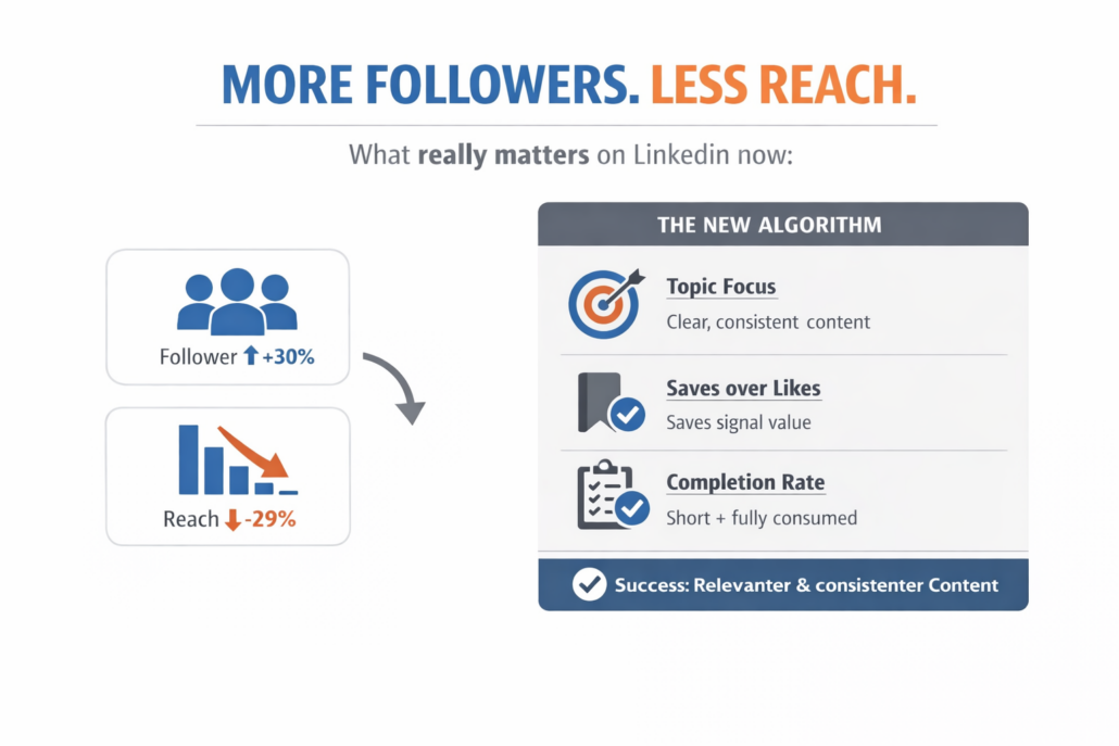
On average, follower numbers have risen significantly, whilst impressions have fallen. There is therefore a large gap between the target audience built up and the people actually reached.
The reason for this is a fundamental change in the algorithm:
LinkedIn no longer evaluates content primarily based on network size or followers, but on relevance and patterns in a user’s behaviour. Two systems work together in this process:
1. One model selects relevant posts based on the significance of their content.
2. A second model evaluates these based on the user’s overall behaviour to date (posts, comments, interactions).
Importantly, the number of followers now plays hardly any role at all. Instead, it is the consistency and quality of the content that count.
Three factors now significantly determine reach:
• Topic consistency: Those who focus clearly on a single topic are promoted more effectively.
• Saves: Content that users save is shared more widely than content with many likes.
• Full consumption: Content that is consumed in its entirety performs better than long pieces that are abandoned early on.
Previous strategies for success (posting frequently, covering many topics, achieving a wide reach) can actually be detrimental today, as they create an inconsistent profile. Large accounts in particular suffer from this.
Success on LinkedIn no longer depends on the size of your follower base, but on how clearly and consistently the algorithm can categorise a content creator. Those with a distinct content profile who create valuable, share-worthy content achieve the best reach.
4. Why Unicode formatting on LinkedIn is problematic:

Most LinkedIn formatting tools don’t tell you this. So, before I share my tips with you, here’s what you need to know. LinkedIn applies a uniform text layout to all content in the feed.
The only tools available are line breaks, spacing, and the replacement of characters with Unicode characters.
Unicode characters include: Emojis: Symbols such as 🚀, typographic ticks (✓, ✔️) or arrows (➜) add visual structure to text.
Special characters: Mathematical symbols, stars (★) or bullet points separate keywords in the profile slogan.
Pseudo-modern fonts: Bold (𝕗𝕖𝕥𝕥) or italic (𝕜𝕦𝕣𝕤𝕚𝕧) fonts generated via Unicode generators highlight important terms.
The problem is this: bold or italic fonts are not accessible (screen readers): Blind or visually impaired people use screen-reading software. This software often reads modified Unicode fonts as individual letter names (e.g. ‘mathematical bold capital A’) rather than as normal words.
Search: The LinkedIn search algorithm often fails to recognise words in generated Unicode fonts. Therefore, never use these for important keywords or your real name, as you will no longer be found via the search! You can also influence how LinkedIn indexes your content, which has a direct impact if discoverability is part of your strategy.
What do Unicode formatters do?
They replace standard characters with Unicode alternatives that display correctly on most screens. This is not native bold or italic text, and LinkedIn’s indexing treats it differently from plain text. This is important because if you format your name, job title, company name or industry keywords, you risk appearing less frequently in search results.
For the characters that play the biggest role in LinkedIn searches – your name, job title, company name, service descriptions and industry keywords – plain text is the safer choice. If you format these, you risk reducing your visibility without realising it.
Formatting is best used only for short structural elements. A heading that signals a change of section. A brief highlight where the reader really needs guidance. A bulleted list where a parallel structure improves clarity. Most posts require one or two formatted elements. No more.
Tip: Formatting won’t save weak content. What it can do, however, is give well-written content a better chance of being read by people who are only partially paying attention.
Use standard Unicode emojis (such as 🚀, 💡, ✓) sparingly as visual separators.
Special characters: Mathematical symbols, asterisks (★) or bullet points separate the keywords in the profile slogan.
Pseudo-modern fonts: Bold or italic fonts created using Unicode generators highlight important terms.
However, keep all letters and words in the standard LinkedIn text format.
This is another reason to write articles on LinkedIn, as these formats are already built into the system and do not impose any restrictions.